branding
Branding is the subtotal of all the “experiences” your customers have with your business.
The purpose of branding in marketing is to establish trust within your consumers and create loyalty. Your brand not only gives your buyers a way to remember you, but it also creates an identity for your business and sets you apart from competitors.
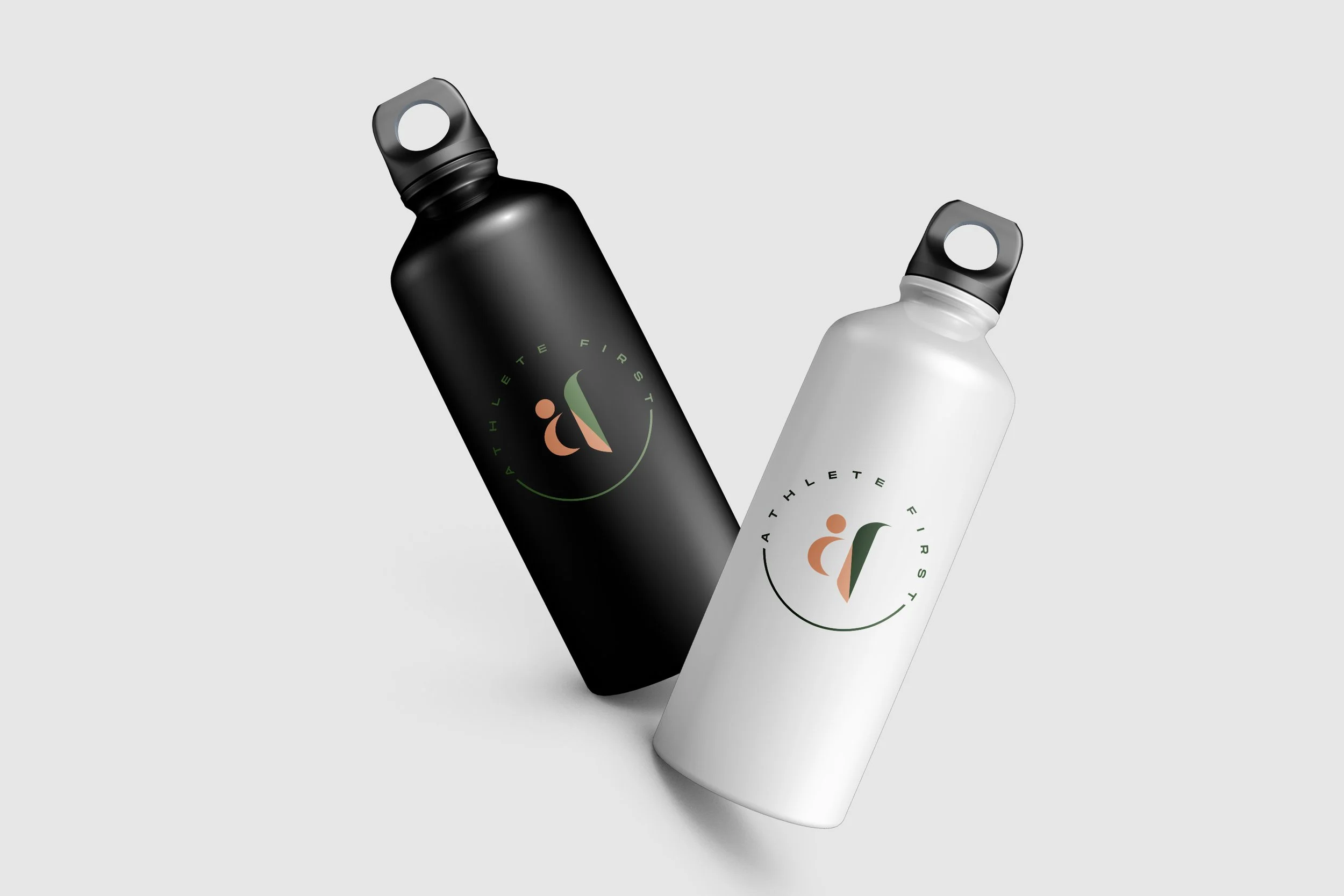
athlete first
Athlete First’ s main goal is to educate, not only in a chosen sport but as an athlete. Educate clients to attain the attributes required to succeed and achieve their goals. Success comes from physical, mental, and emotional. Hence this is not just an average sports page but it is so much more. As we converse more with their founder, we realise the heart of Athlete First is building not just a wholistic athlete but to make an impact to the community a s they are looking to become the leading voice to inspire and challenge the youths of tomorrow.
With that, we purposely build the brand to have a human icon in it and the chosen colour palette to have more of a human feel to it rather than the usual strong colours used for sports these days.❤️
huntwo studio
Huntwo Studio is a videography studio owned by Sabahan Al Hanafi & Sarawakian Candy Yik and we are all about supporting local talents. Huntwo came to us and was keen on having us design their branding and the rest is history.
Here’s a little look into the experience that they had with us from Al Hanafi. “We’re super happy that Eleni managed to capture our hearts on the very first draft. That doesn’t happen often but she managed to impress us with her extraordinary skills. If you need a professional design with the best 1-to-1 discussion for your logo design, Eleni is the person you should look into no doubt!” - Al Hanafi


opodos spice
I had a wonderful journey with Opodos as it started from chit - chatting about their up and coming food venture and name suggestions of the product/services to the final look of the brand.
In Sabah, the Kadazandusun people use the word “Opodos”, which means “spicy” — it’s as simple as that. When translated literally, Opodos Spice name means “Spicy Spice” .But that is precisely what their dishes are: delicious food cooked usinghome blended spices that brings sensation in every bite. And there’s no other name that reflects our brand and identity better than that.
The font “MASTERBLUSH” was used to help bring out the fun element for this logo. I also played with patterned design for this particular project as it helps to bring out the Indian roots in their product and the final seal was the star anise icon that is heavily used in this cuisine.
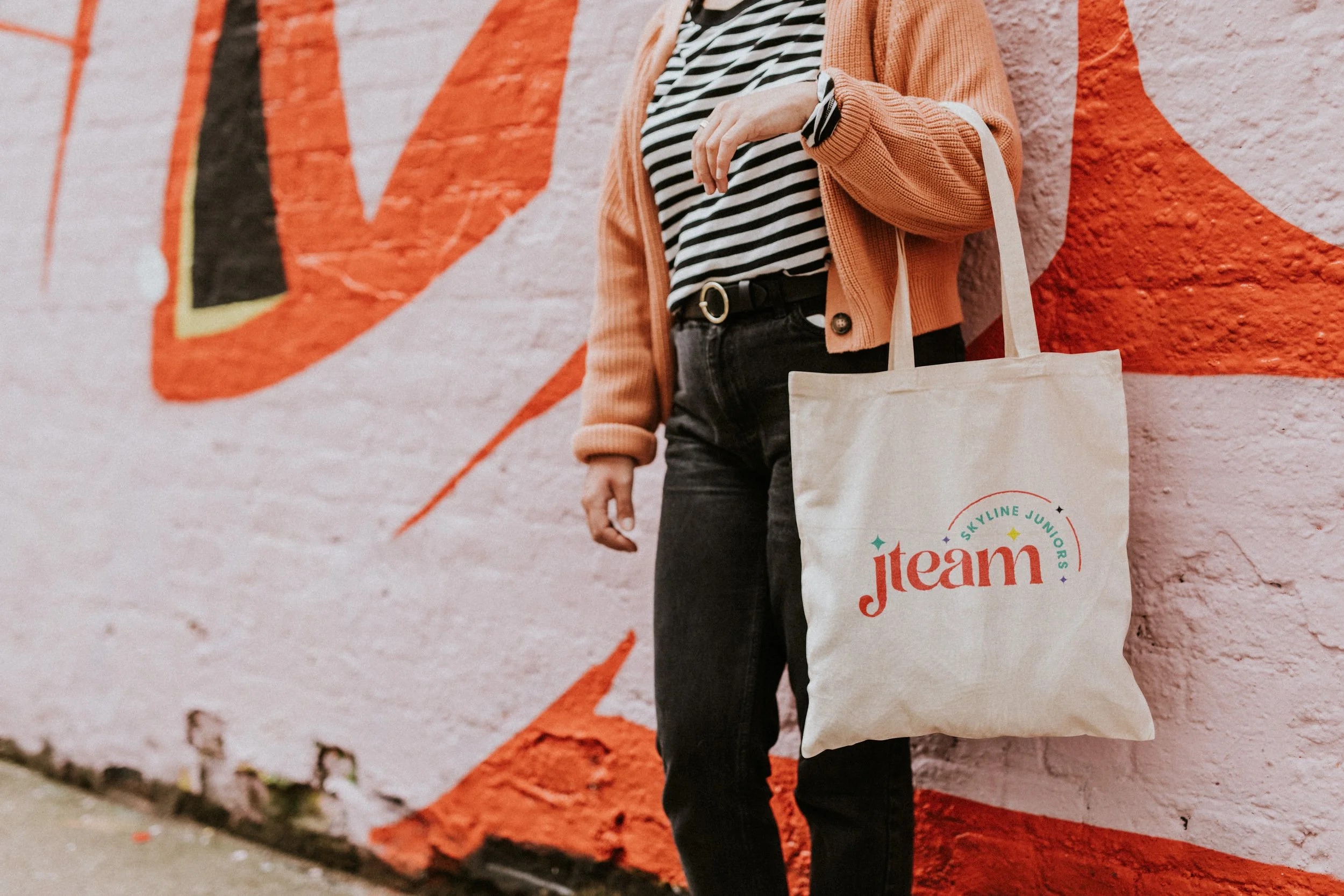
j team
We were given the privilege to do the branding for J Team, the children ministry from Skyline SIB. Target audience are mainly kids and their parents, hence we went with something fun,
colourful and vibey. It was a fun project to work on. We are so happy with the outcome!
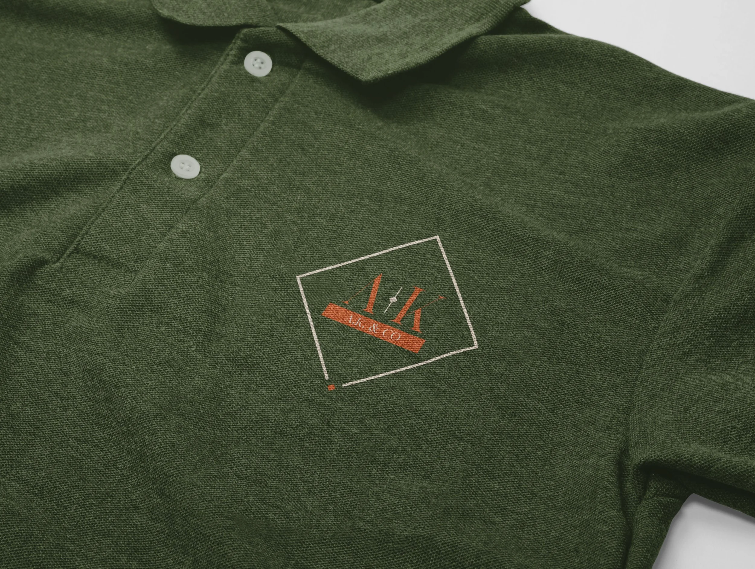
a.k. & co
We are delighted with the branding work done for A.K. & Co, a new and upcoming Accounting Firm based in Kota Kinabalu, Sabah. The client wanted it to reflect a personal touch kind of
vibe instead of the usual and we delivered just that and more. Thank you for having us journey with you on your new venture!
cj liew
With CJ Liew & Co, a full - service law firm founded in 2000 in Kota Kinabalu, Sabah, we wanted to elevate the already existing logo into a wholesome and an all rounded brand.
With the whole idea of elevating the existing designs to another level, we then decided to introduce:
a) A new set of complimentary colours
b) Geometric Pattern
c) Textures such as gold
